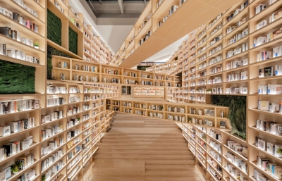
Letterform Archive describes itself as “a nonprofit center for inspiration, education, and community in the letter arts.” That may sound simple enough, but take a step back and think about how much letter arts literally envelop the history of language and human communication. From style guides for Coca-Cola, book design in the sixteenth century, or the hand-written origins of some of the world’s most famed fonts, Letterform Archive collects, preserves, and tells the story of the importance and fascination with letters across multiple centuries and every continent. We sat down with Letterform Archive’s Stephen Coles (author of the influential The Anatomy of Type and publisher of Typographica.org) to discuss the acquisition of the world’s letter history, who uses their resources, and the conundrum of “handmade.”
All photography by Alex Nicholson
Evan Pricco: When visiting the Archive, we saw just the tip of your iceberg of a collection. There is so much there, so much history, as well as current research abounding on the topic of typography and the history of letters. Knowing how overwhelming this must be, what do you consider to be the primary function of the Letterform Archive?
Stephen Coles: Our goal is to document and preserve written communication and use that record as a source for education and inspiration for anyone who works with letters. This mission does sound daunting, but it’s also exciting. The Archive is designed to be a living collection, evolving with the way letters are made and used as technology and tastes change. This means we are concerned not only with the history of visual art, but also its present and future. While that historical scope is broad, our narrow focus on typography and lettering allows us to be more targeted than a museum or library that encompasses every sort of art or design.
You mentioned receiving donations of some fairly substantial and important type and letter collections, things that designers and enthusiasts would consider crave-worthy. What have been some breakthrough acquisitions for the Archive?
Last fall, the Archive acquired over 200 wood type prints from Jack Stauffacher, the legendary San Francisco printer-typographer. This unique series represents Stauffacher’s experimental side, with mismatched wooden letters providing, simultaneously, a semantic constraint and a material freedom. The prints will be reproduced in a facsimile edition, which demonstrates how acquisitions are leading to books in Letterform Archive’s nascent publishing program.
Also, last year we received an important donation from Emigre, pioneers of digital type design. It includes archival material in various media, such as a complete run of Emigre catalogs, development files for original Emigre typefaces, and audiotapes of unedited interviews with Emigre magazine designers and contributors that offer an oral history of the design community, as well as printed sheets, posters, ephemera, and paste-ups.
Other recent additions include the archives of Ross F. George, founder of the influential Speedball pen company, and Aaron Marcus, a seminal figure in computer graphics.

Students, researchers, and just plain curious visitors from around the world come see the collection. What has been the impetus, and what are some of the reasons that people come to seek you out? Are they looking to make their own fonts? Are they designers learning the history of smart design? Tech people looking for inspiration, or are they just history buffs?
The range of visitors is remarkable, and you just covered some good examples of who we’re seeing come through our doors. Graphic designers, type designers, web developers, artists, historians, and writers all seem to find something that connects to their specific work or interests, whether it’s through visits to the collection, or attending our workshops and lectures.
Dutch influence and history seems to be prominent in the history of letters, right? What other countries are a wellspring and draw interest?
Since the sixteenth century, the Dutch have been linchpins in the history of printing and typography. That story is well told by the Tholenaar Collection at the Archive. Later, the country sprouted multiple pioneers in Modernist design, such as Piet Zwart of whom we have a large collection. The Dutch influence continues today, and it’s often joked that there are more type designers per square meter in the Netherlands than any other country.
Our collection also reflects other historical design epicenters like the UK, Germany, Switzerland, France, Central Europe and Russia, and, of course, the US. More recently, we’ve been actively seeking out work from the Eastern world and Latin America.
As documented on this tour, there was obviously a time in our history where everything was handmade, fonts were made by hand, ginger ale labels were painted by hand, all demonstrating a fine art quality to the history of letters. We often talk about the “maker” revolution that we are seeing in America, an attempt to revive this history as much as possible. You showed us the brilliant work of someone like Russell Maret, for example. Seeing his books and work is like going back in time. I imagine these types of innovations and movements keep the Archive excited about the future.
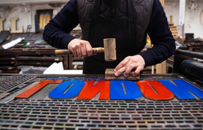
The concept of “handmade” is a flexible one. From my own perspective, letters always come from humans. They did before the computer, and still do today—it’s just about the tools we use, whether it’s a handheld pen, or a handwritten Python script. But it’s true that analog objects do inspire a lot of interest among our visitors. Being in the heart of San Francisco’s tech boom produces regular group visits from companies like Apple, Facebook, Google, and dozens of startups. Those who work on screens all day are energized by seeing stuff made of paper, ink, and lead. Yet, it’s not just about eye candy and nostalgia; it’s fulfilling to hear how these designers and coders can relate seemingly unconnected artifacts to their own work.
As you continue to grow in both collection and influence, what do you hope the future holds for the Letterform Archive?
We are on the heels of launching our publishing program with a comprehensive monograph of W.A. Dwiggins, the man who coined the term graphic design. The book by Bruce Kennett will launch on Kickstarter in the next couple of weeks. Several other books are in the pipeline. Each draws from our collection and features our state-of-the-art photography and reproduction.
Digitization of the collection is also core to our mission, and we spent a lot of time perfecting the way we capture each book and poster so they are as lifelike as possible. The results of this photography will appear in a searchable online gallery on our new website to be launched very soon.
What's one piece of letter history that you have your eye on?
Our next challenge involves documenting and preserving the history of digital typography and type design. Most typefaces today are produced on a screen, from vector sketches to font generation. If we’re going to house and display type as it exists today and in the future, we have to find ways to archive the development of this work that is often purely digital. We’re learning from and collaborating with other institutions, like the Internet Archive, who have similar goals.
-----
Originally published in the May 2017 issue of Juxtapoz Magazine, on newsstands worldwide and in our web store.


