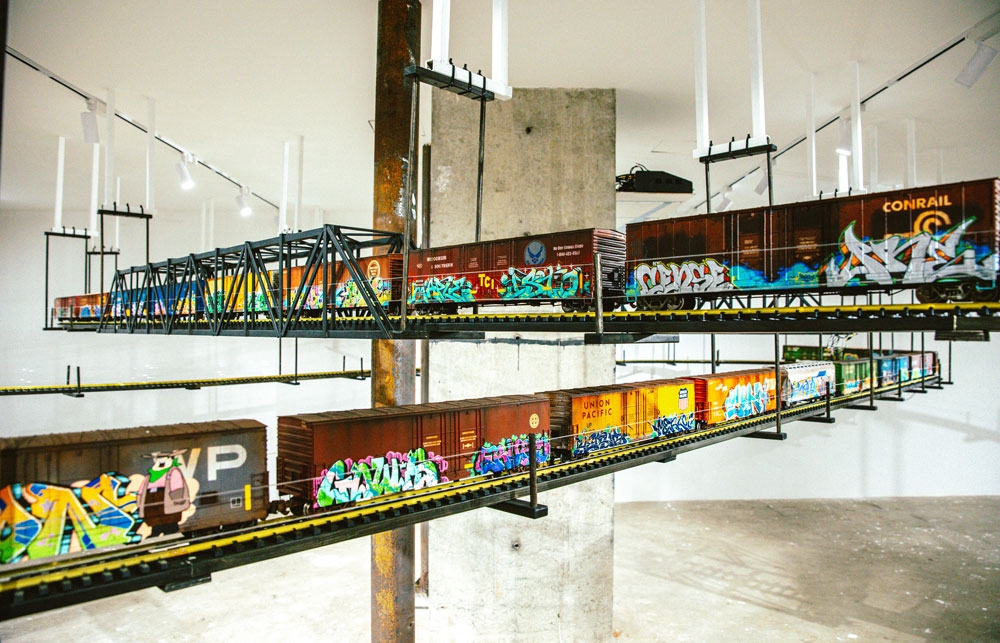
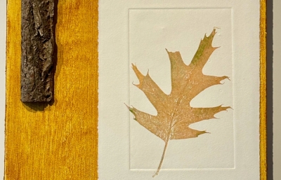
A lot of what you do is about infrastructure, similar to some of my all-time favorite painters like Charles Sheeler and Charles Demuth, who were part of the Precisionism movement and made these paintings of industrial buildings and infrastructure in the 1920s and ’30s. Besides graffiti, do you see yourself in that sort of American tradition of making art about industry and the infrastructure, that sort of pre- and post-Depression era style?
I certainly feel that freight train graffiti is an American folk art. Though I’ve never thought about it that way, I can see a solid comparison to the Precisionism movement. I like the clean geometry of the railcars as well as the logos and stenciled information that adorns the trains. Kind of like Charles Demuth’s I Saw the Figure 5 in Gold. There is also the industrial look of rivets, ribs, doors and ladders and the shadows they create that I find compelling in creating these images. You also have the precise lines and geometric forms in the graffiti.
But I’m also drawn to seeing how orderly mechanicalism begins to fail, whereas the Precisionists were inspired by its clean look and strength, I believe. I like the dichotomy you have with these giant steel vessels that are slowly deteriorating due to weather and time, but within them are these new and shiny products waiting to be used.
The original paint jobs on the trains often also remain from railroads that no longer exist and have only been renamed and numbered to the larger rail company that bought them out, but didn’t bother with rebranding the entire car to the new ownership. Then, of course, you have the colorful graffiti applied as the next unsanctioned layer to the original that ironically is probably even protecting against some rust and decay! Together it can all appear pretty chaotic, like many stamps of time.
By painting a lot of the old, decommissioned train logos in my work, I like to think I am preserving an era of the railroads when there were many more short lines with a heavy branding push to differentiate one shipping company from the next, recognized through logo design and colors. That same idea could almost be used to describe graffiti.
Timconlon.com // This interview was originally published in our WINTER 2025 Quarterly // The headline image comes from the BEYOND THE STREETS installation in Shanghai, 2023.


