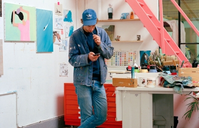
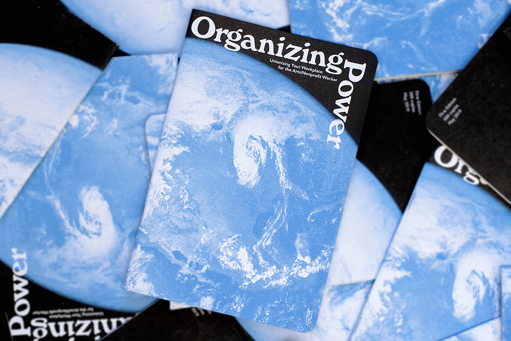

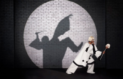

“I was out looking for the comet, and now I’m researching frog cars.” This is a typical text from my friend, Jessalyn Aaland. Enabling art to activate consciousness and propagate positivity, she’s made contemporary art more accessible for young folks worldwide, thanks to her revolutionary Risograph project, Class Set. Commissioning posters by many of our favorite artists, the project inspires kids to make their own activist art. Her Guide for Youth Protestors empowers demonstrators, and her zine, Organizing Power, informs museum workers about the benefits of unionization. My girl is a didactic delight, consistently proving the power of art to ignite change.
Kristin Farr: How do you feel about a moon cactus?
Jessalyn Aaland: They look cool but they’re fucked up. It’s one cactus grafted onto another, and eventually the top part dies. I have one, and now it’s just a long arm that grows like a floppy snake. It’s a novelty and artificial, but it looks cool, so I’m torn.
Like food with faces.
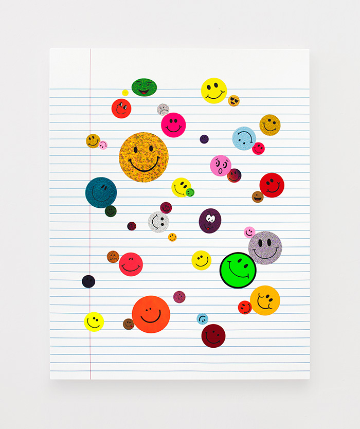
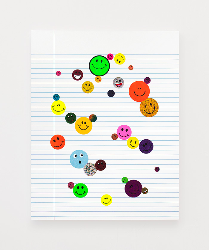
I love homemade street signs, especially when they have food with faces. You know I love smiley faces. They’re delightful and disgusting, and kind of fascist. Like, “Smile! It’s the ’70s! Everything’s great!” But that was a very dark time in American history when you look at social movements. There was social change in the ’60s, like the uprising moment we’re in now, but things took this turn in the ’70s, with the rise of neoliberalism. So this commodified happiness symbol is wrong, but also great. When things have faces, they’re happy and disgusting, and funny and horrible at the same time, which is like humanity and the experience of being alive. 
You’re the foremost scholar on smiley face history.
I’m also into symbols like peace and recycling signs. Humans have this need for symbols. I’m a big sticker collector and I reference them and make my own large ones. I have a good cache of ’70s fluorescent smiley stickers. I love the craft store variety, and Euro stickers with gold edges. I never thought about it as an archive, but I guess it is.
I situate everything in a broader context of politics and where society is at. A painting of smiley faces looks innocuous, but everything has political implications. I did a series of symbols, like a recycling sign that goes squiggly and is a little rebellious, which is funny, but now we know recycling doesn’t really exist because we generate too much waste. It’s really a civic symbol, a corporate, dead, emotionless call for environmentalism. When I was a kid, I wrote Save-the-Rainforest poetry.
Not surprised. Also, I just flashed back to a memory of you taking a photo of a church sign with many symbols.
It had every symbol, peace signs, yin yangs—get ’em all up there! My work has embraced a graphic design component, even though I’m not really a designer. I became an artist because I spent my teenage years making posters for shows and zines at Kinko’s, so I’ve had an investment in graphics in an alternative way. I’m interested in iconography and symbols; they’re not universal, and they change culturally.
Like how the Buddhist and Nazi symbol looks the same.
As a young person, when I found out the twist of how that symbol changes the meaning so profoundly, it was fascinating. I’ve been involved in activist social movements, and systems are often represented through symbols, whether they’re religions, civic institutions, or political groups, as the symbols are important to narrative-building and persuasion. There’s a cycle where groups in power generate symbols, and groups trying to gain power do the same, and then people appropriate them. It’s a core, human thing. 
It seems you developed design skills to enable art’s message, and I know you work well within constraints.
It helps frame things. My favorite Corita Kent quote is: “Limitations allow you to choose from something rather than everything.” Having limitations and creating your own systems is a way to focus. I use as many tools as I can, but I set parameters. Graphic design has influenced me in that I like flat things, and the best way to achieve that is by using a computer. I want to remove the hand and the individual in some ways. I’m uninterested in the idea of technology, but I actually rely on it to make all of my work.
Like Class Set, let’s talk about that.
I was a teacher, and urban public school classrooms are not the most updated places. I had black mold and mice in my classroom. Every teacher in the world is desperate to cover their ugly classroom walls with posters that reflect social justice values, especially those teaching within a liberation framework.
I had access to a Risograph printer at a residency, and I was thinking about how everybody loves quotes. Students loved sharing them when we studied aphorisms, so I hand-inked some quotes from Gloria Anzaldúa and Ursula K. Le Guin, added a simple background, and ran them off in two colors. I gave them to the other teachers, and the posters offered students a mental break when they spaced out. They’d see puzzling art and an interesting quote to grapple with.
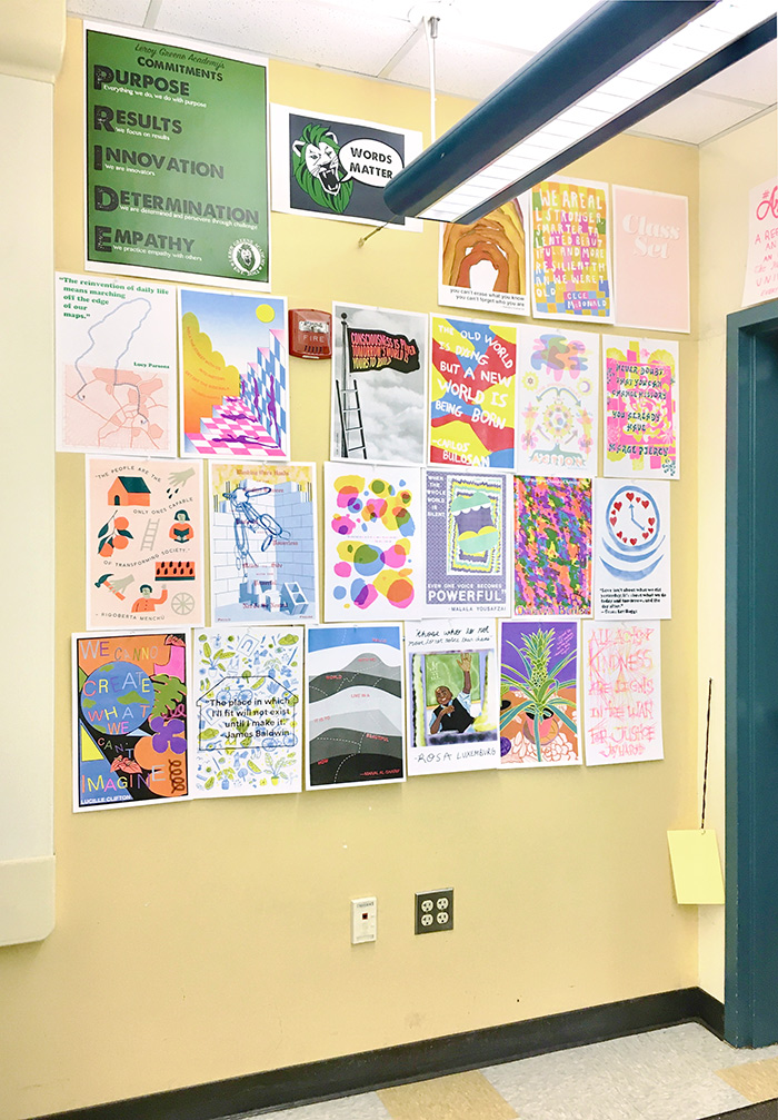
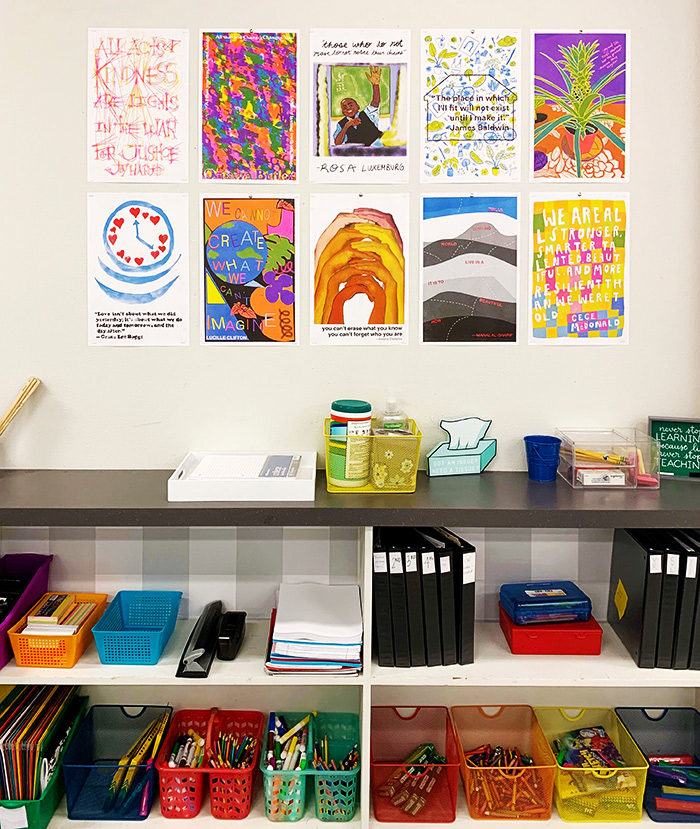
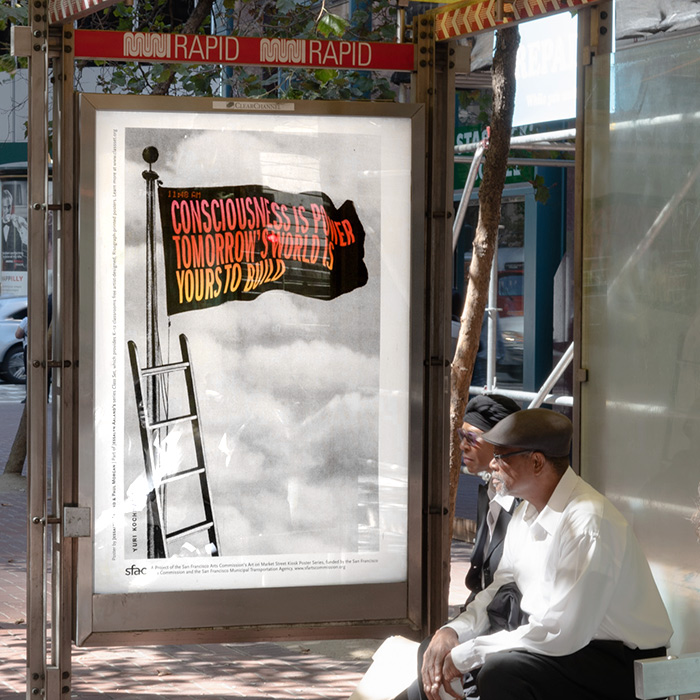
Then I got a grant to make ten posters with different artists. Social justice posters have recurring aesthetics, so I wanted to work with contemporary artists who represented student populations. Artists made new work paired with quotes from authors who students could learn about—these regular people who decided to do something. You can make a lot of radical change in who you select as role models as an educator. The grant allowed me to buy a Risograph machine to print and distribute to teachers for free. I only planned to give them out locally, but I got requests from all over the world.
There’ve been four sets so far, funded by The Andy Warhol Foundation via Southern Exposure, Oakland Stock, and a recent one with the San Francisco Arts Commission. Those were displayed in bus shelters on Market Street, which has an ongoing role as a site for protests, and all the quotes were about activism. The latest was organized by the Portland Institute for Contemporary Art with local artists and notable Oregon authors. I’ve given away almost twenty thousand posters to teachers. Non-teachers can donate and then receive copies, which helps fund the project.
I’ve also worked with students to design their own posters that I print for them. I taught a class in Portland, and after I printed the kids’ posters, the teacher drove around and delivered them to each kid’s house. Many of them live in stressful circumstances, so I hope having the posters they made with their classmates brought a little joy. When you’re working to change things and learn about systematic oppression, you need moments for humor and joy, or else, what’s the point?
What do you notice about the kids’ posters?
The world comes up constantly as a symbol, and seeing teenagers draw land masses is interesting. It reminds me of how I draw a pepperoni pizza: evenly dispersed.
Earth is on the cover of your Organizing Power booklet.
That was designed by my partner, Paul Morgan. We were riffing off the Whole Earth catalog, which was popular in the design world. The aesthetics were really particular to California at the time. Graphic design is often riffing off other aesthetics.
And now for my age-old question about the difference between art and design.
Design is purpose-driven. Bringing together and organizing information, people and graphics, and reinterpreting that—the arrangement is the part that I add. Design is about innovating within parameters.
Humanity is constantly riffing off culture, and obviously, it happens in ways that involve shitty power dynamics, but it also happens in great ways. Adapting visual culture for our purposes is one of the better things about humanity if it’s done in a way that aids liberation.
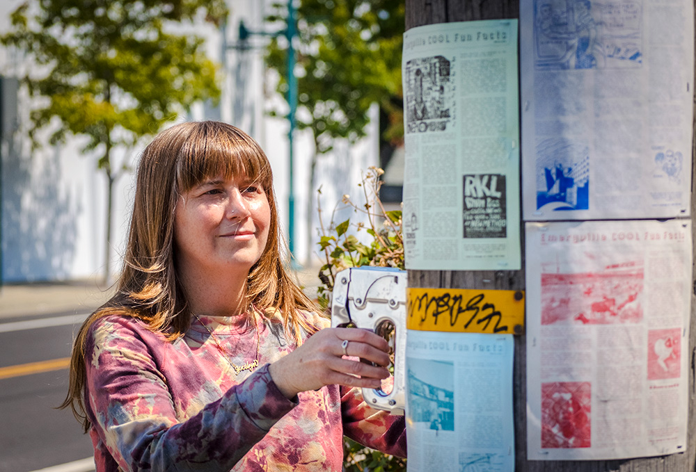
Let’s get to your Cool Fun Facts.
Daily walks have been my main activity lately, like many people. One thing I miss about pre-Internet proliferation is how people used to communicate more through handmade flyers, even just their rants in a small typeface, photocopied and stapled to poles on the street. It’s delightful when people reclaim public space, particularly those who aren’t supposed to have access and use it in ways it’s not intended for.
I wanted to make some flyers related to where we live, Emeryville, California, because I’m interested in connecting to a sense of place. The more connected you are, the more invested you are in the people around you, and improving things for them, too; a collectivist, communally-driven interest. Emeryville Cool Fun Facts is a newsletter about niche topics, and it explores history and the environment, mostly through jokes. I’m figuring out how to make it enjoyable and fact-based, because history writing is often so serious.
People stop me in the street when they see me putting it up, and I get quite a lot of messages on my ECFF hotline. I’ve gotten to know people in my neighborhood more, and I wanted to give them a little unexpected joy. I take on a persona to write it, which is really another version of myself.
Your work is uncategorizable.
It all comes from a place of wanting to dismantle and dissipate systems. The other aspect is that you need to be inspired to do that, so I include humor and bring art into everyday experiences—key things that cross different mediums.
Jessalyn Aaland’s next edition of Organizing Power will be released this fall. Find her Cool Fun Facts posted on the streets of Emeryville, California and at EmeryvilleCoolFunFacts.com.