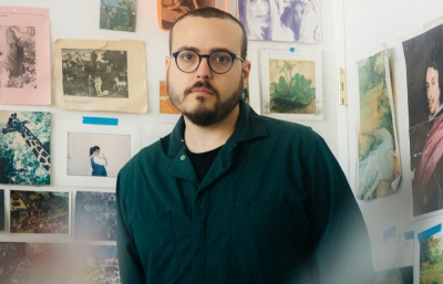
Think of wallpaper, and chances are, like me, your grandma’s house comes to mind. Maybe you think of her smoking a cigarette, a memory framed by her wallpaper in the background. That’s how far back we are talking when remembering the heyday of wallpaper décor But times are-a-changin’, and Brooklyn-based Flavor Paper has turned the business of wallpaper into industrial design, fine art, and site-specific installation work.
We sit down with President and Creative Director Jon Sherman to discuss a new wave of wallpaper design, Warhol, and transforming your dining room into Wayne White at home.
Read this feature in the September 2016 issue of Juxtapoz Magazine.
Evan Pricco: When I was a kid, I had some sort of baseball-themed wallpaper in my room, but my mom quickly went with a more mature style when I got older. Did you have wallpaper in your room as a kid?
Jon Sherman: I didn't have wallpaper in my room, but we did have some bright, poppy yellow 1960s-style paper in the kitchen. We have family photos of me at my first birthday, partying with cake on my face in front of it. My mom was always a wallpaper fan, but she took a long time-out from using it in the ’80s and ’90s like most of America.
How did Flavor Paper start? From what I read, it went from Oregon to New Orleans, and now Brooklyn.
FP was a total accident. I was working on an interiors project in Miami and a friend showed me some wallpaper she was trying to source for a client. The guy who owned FP called her back to say he was literally dragging everything outside and burning it on site. She showed me some samples and I thought it was beautiful and flew out to rural Oregon to check out what he had left of the equipment. He told me I could have the 48-foot long, 6,000 pound table and 300 screens if I got it out of his hair. I hired a log lifter, a truck driver, and loaded all of it into a 54-foot trailer and sent it off to New Orleans, where I was living at the time. I got a warehouse under contract and rolled it all in Egyptian style. Then I had to teach myself how to make wallpaper as there weren't any books or guides. It was 2003, so the Internet wasn't much help.
Our printing system is hand silk-screening using a 48-foot flatbed vacuum table, which is quite unique, and large screens that gave us huge repeats of 62 inches. I made an early decision to go water-based, which ended up making life a helluva lot harder, but was definitely the way to go. I wanted to use Mylars and foils as ground materials from the get go, and mixing those with Day-Glo inks really helped set us apart early on. Our UK competitors snarkily called us the "shiny wallpaper" people, but to me, it was a vast improvement on their dark and somber aesthetic. I wanted people to be happy and inspired in their interiors, so bright colors, fun subjects, infused with humor and whimsy was key to finding our voice.

Our first collection was released at ICFF (International Contemporary Furniture Fair) in NYC in spring 2004. People were completely divided. Veteran designers who had been through the wild Mylar movement of the 1970s said they couldn't go back, but younger designers loved the bold, colorful metallic vibe. We got some great press and things took off, only to be shut down by Hurricane Katrina. I thought FP was over, but we rebounded and were back in action in by November 2005.
We first used the original patterns made by FP’s founder, but released original work for our second collection. I found Dan Funderburgh’s work in a graffiti book, and he was doing exactly what I wanted to do with wallpaper design, and better than I ever could have pulled off. He had the classic design angle down, interjected with all sorts of modern urban elements, comical bits and unexpected twists that turned wallpaper design on its head, yet respected tradition. I reached out, and we’ve been making great wallpaper ever since.
Did wallpaper really, dare I say, go out of style and then come back into style? Or is just that since I'm now of the adult-settled age, I notice it again?
Oh, it definitely was gasping for breath in the late ’70s and early ’80s after it became a mass-produced, low quality background concept. We helped bring it back by concentrating on making wallpaper full wall art. High-end, hand-painted wallpaper never went away, but was also so expensive, it never hit the mainstream. There has been quite a comeback over the past five years, with pattern becoming much more popular throughout society, assisted by the death of the white wall movement. Our first year showing at ICFF, there were three wallpaper companies, while this year there were hundreds.
Wallpaper, obviously, enhances the home. But what's really cool is that yours is like installation art, really transforming and tying together a fully immersive project. Was that an intention early on, or a really cool evolution of the brand?
It was something I liked about wallpaper from the beginning, and because we had such large-scale patterns, it was evident that size and scale had a truly dramatic effect and helped realize my goal of bringing wallpaper to the foreground from the background. We focus on immersive work with a dramatic impact. People love to be transported, and a wallpaper installation can deliver that economically.

The Warhol stuff you are doing is so perfect. How did that collaboration come about?
We worked with the Montclair Art Museum on the Warhol and Cars exhibit in 2011, where we turned Andy’s Twelve Cadillacs print into a wallpaper. His foundation, apparently fans of the work, had been contemplating releasing Warhol art as wallpaper, so when they approached a number of companies, we were asked to present. We were extremely interested and felt our style and aesthetic were right in line with Andy’s, down to our Factory-like studio with its mirrored ceilings and experimental angle. We took a lot of risks in our presentation and used work that wasn’t well known, so the Foundation granted us the global wallpaper license. It quickly became our best selling, with Flowers and Crowd leading the way. We have had so much fun developing the Warhol wallpapers as we try to work in all of Andy’s styles and approaches. For example, we spray yellow toner into the Flowers screens in homage to his piss paintings, use lots of Mylars to mimic his Silver Clouds, and paint into the screen to produce monoprints as the base for Marilyn Monroe.

Wayne White is a cool story because you based the wallpaper pattern on a mural he completed at his home.
I met Wayne through Josh Liner and have always loved his work. I own his Smartest Artist painting, one of my prized possessions. We discussed wallpaper and he told me he loved Chinoiserie-style French murals and had been working on such a mural in his dining room with his son for ten years. It was a genius and perfect application of his style, and I indicated that I would love to make it into wallpaper. He initially thought he’d have to paint something in order to make a wallpaper, but I explained we’d rather shoot what he’d done and capture all of the wabi sabi elements of this personal project. I went in with Boone Speed and shot it in great detail, then built it out into a mural style wallpaper with all of the texture of his plastered walls. We even had Wayne paint over a printed section of wallpaper where a built-in cabinet was in his home. The final mural has a section that is painted over wallpaper, but built back into the original painting! It won “Best of ICFF” this year, so we’ve been pretty psyched. It’s a truly transformative piece and I absolutely love it.
----
Originally published in the September 2016 issue of Juxtapoz Magazine, available here.


